Every section in EcomWize is fully customizable. Once you add a section to your canvas, you can modify its text, images, icons, colors, layout, visibility, and more. Changes are previewed live on the canvas as you make them, so you always see exactly what your visitors will see.
To configure a section, you first need to select it:
Click on any section on the canvas. A blue highlight border appears around the selected section.
The Section Settings panel (right sidebar) opens automatically, displaying settings for that section.
The section toolbar also appears above the selected section with quick actions.

Most content editing in EcomWize happens directly on the canvas. You click on an element to edit it in place, without needing to use the settings panel.
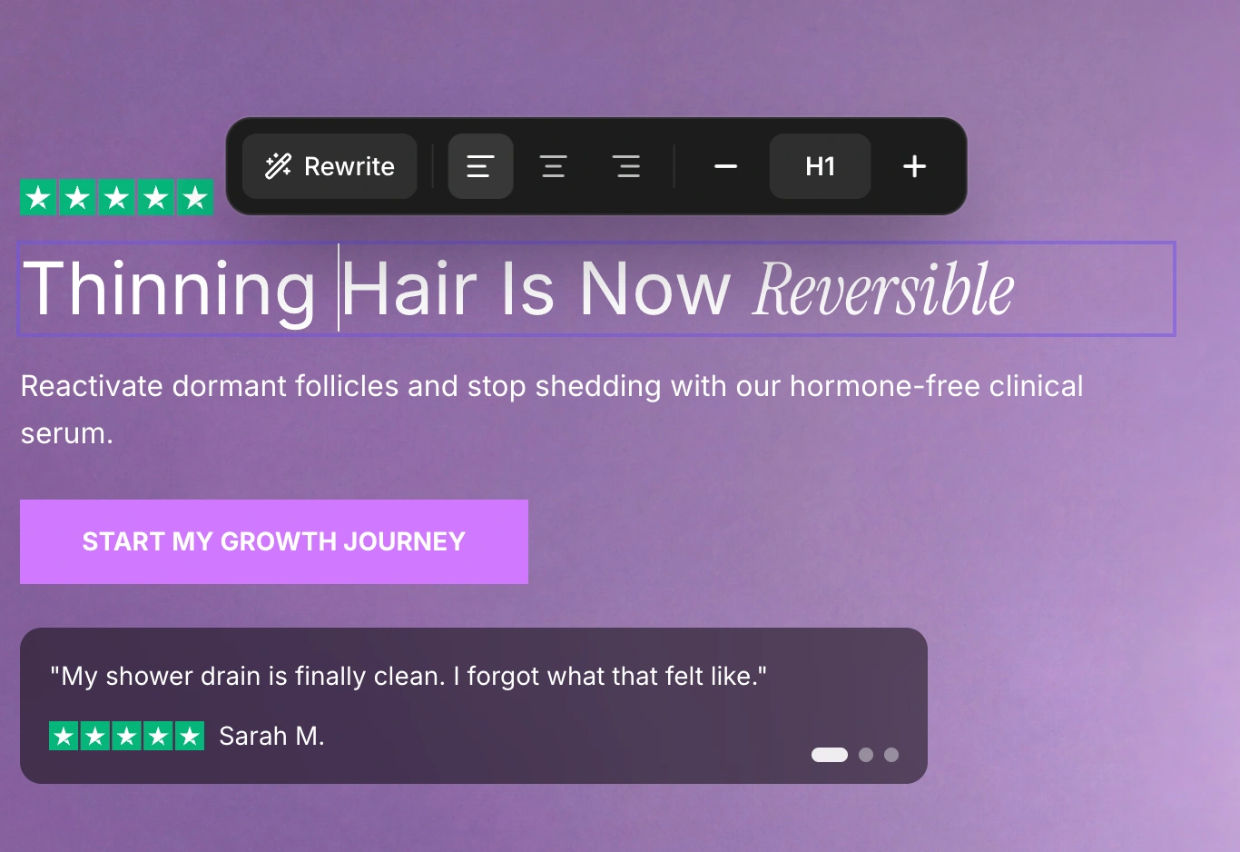
Click on any text element (heading, paragraph, button label, etc.) directly on the canvas to edit it. A floating text formatting toolbar appears above the selected text with options for:
Bold, Italic, Underline, Strikethrough
Text highlights (applies your brand's highlight font to selected words)
Text color (apply a custom color to selected words)
Text size (change the heading level or paragraph size)
Text alignment (left, center, right)
Reset formatting (remove all formatting and revert to plain text)

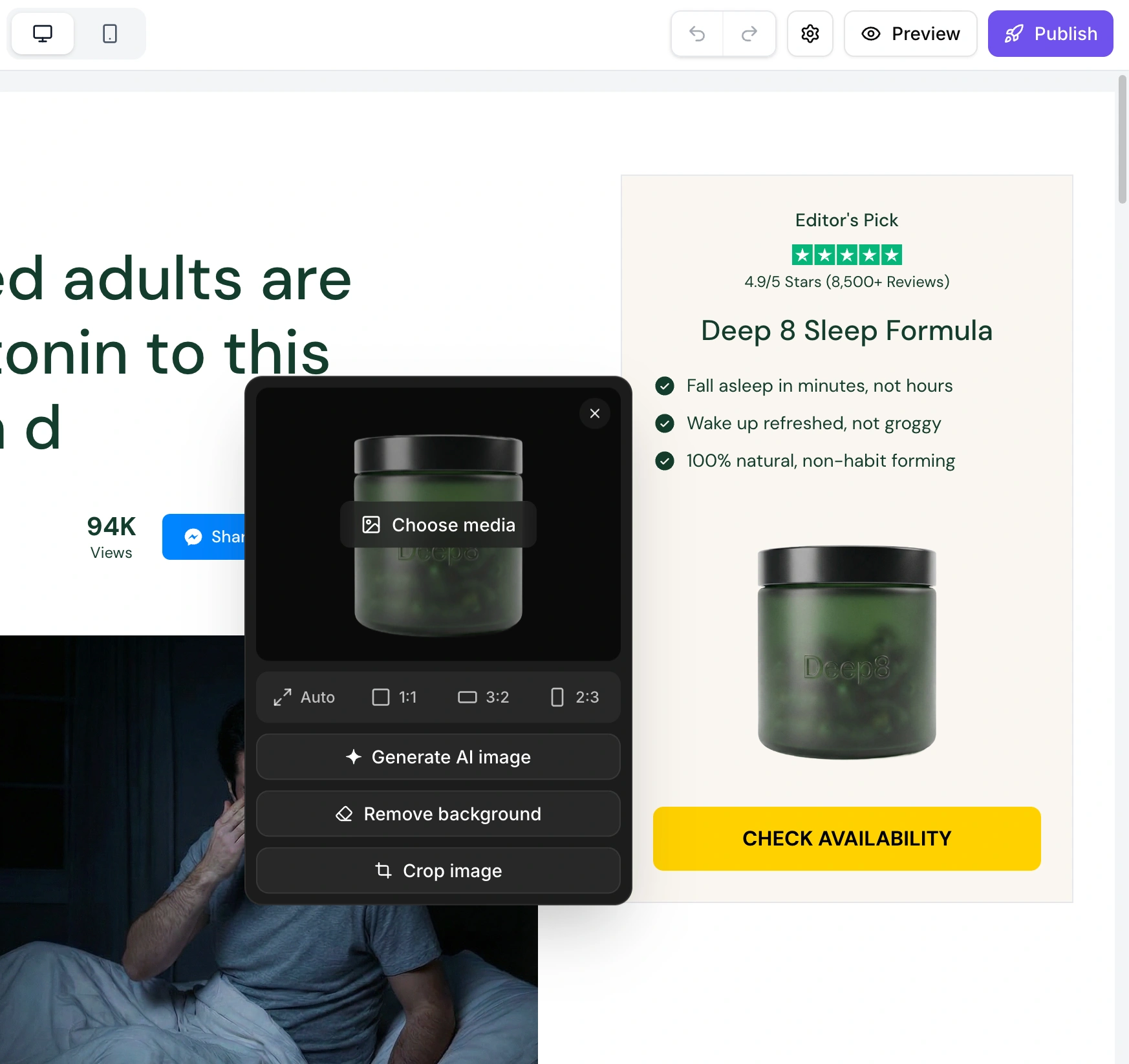
Click on any image element in a section to open the media editor. A floating panel appears next to the image with:
Media preview showing the current image or video
Choose media button to open the media panel (upload new media or select from your library)
Aspect ratio selector (Auto, 1:1, 3:2, 2:3)
Generate AI image to create an image with AI
Remove background to remove the background from the current image
Crop image to crop the current image
All sections support both images and videos. When a video is selected, additional settings appear:
Show play/pause button - toggle between a video with controls and a muted background video
Dynamic thumbnail - when play/pause is enabled, toggle whether the video preview autoplays before the user clicks play
Play/pause colors - choose the button theme (Neutral, Brand, or Reverse)
Supported formats include JPEG, PNG, GIF, WEBP, SVG for images and MP4 for videos. Maximum file size is 5MB.
Click on any icon element in a section to open the icon toolbar. The floating toolbar lets you:
Search for icons by name (e.g., "shield", "heart", "truck")
Browse popular icons
Select an icon weight (thin, light, regular, bold, fill, duotone)
The Section Settings panel is the right sidebar that opens when you select a section. It contains settings that are not handled by inline editing. Different section types show different settings based on what they support.
For sections that support layout options, you can choose:
Desktop Layout - Media Left or Media Right (controls which side the image appears on desktop)
Mobile Layout - Media Top or Media Bottom (controls image position on mobile)
Toggle optional elements on or off for each section. Available toggles depend on the section type and may include:
Show Subheading - display or hide the subheading text
Show Bullets - display or hide the bullet point list
Show Star Rating - display or hide star ratings and review text
Show Badge - display or hide badge elements
Show Guarantee - display or hide guarantee text with icon
Show Share Buttons - display or hide social share buttons
Show View Count - display or hide view counter
Show Profile Image - display or hide profile photos in testimonial cards
Show Button - display or hide the call-to-action button
When a section has a button enabled, you can configure:
Button link - choose between linking to a URL or scrolling to another section on the page
Show icon - toggle the button icon on or off (click the icon in the button on the canvas to change it)
For banner sections with ticker/scrolling text, you can configure:
Speed - how fast the text scrolls (10-200 px/s)
Direction - scroll left or right
Pause on Hover - stop the animation when the mouse hovers over it
Every section shows color pickers for the colors it supports. Available colors vary by section type and may include:
Background, Background Elevated
Headline text, Body text
Icon, Stars, Divider
Tag, Number Badge
Button, Button Hover, Button Text, Button Border
And more depending on the section type
Colors inherit from your brand style by default. Click any color to override it for that specific section. A "Reset" button appears next to any overridden color to revert it back to the brand style. Use "Reset All" to revert all color overrides at once.
An Invert Background toggle is available to quickly swap your primary and elevated background colors.
Product sections have additional settings for their snippets. When a product section contains specific snippets, their settings appear in the Section Settings panel:
Add to Cart Button - configure on-click behavior (go to cart or checkout), cart type (cart page or custom cart drawer), and button options (show icon, show price, positions). See Integrations for supported cart drawer apps.
Star Rating Widget - select your reviews provider (Loox, Yotpo, Stamped.io, Judge.me, Okendo, TrustWILL). See Integrations for more details.
All changes you make - whether through inline editing or the Section Settings panel - are previewed live on the canvas in real time. There is no "save" or "apply" step. What you see in the builder is what your visitors will see on the published page.
This includes:
Text changes appear character by character as you type
Color changes update the section immediately
Image swaps show the new image right away
Toggle changes instantly show or hide elements
Layout changes reflow content in real time
Each section type has its own unique set of configurable properties. Here are some examples of what you can customize on specific section types:
Section Type | Example Properties |
Hero | Heading, subheading, button text, button URL, background image, layout alignment, star rating, badge text |
Benefit | Card headings, card descriptions, icons, icon color, card background |
Testimonial | Reviewer name, review text, star rating, avatar image, reviewer title |
Stats | Stat values, stat labels, stat icons, prefix/suffix text |
Banner | Banner text, background color, text color, ticker speed, repeating text items |
FAQ | Questions, answers, default expanded state |
Product | Product snippets, snippet order, add to cart settings, reviews provider |
Every change you make to a section is tracked in the history stack. If you make a change you do not like:
Press Cmd+Z (Mac) or Ctrl+Z (Windows) to undo
Press Cmd+Shift+Z (Mac) or Ctrl+Shift+Z (Windows) to redo
EcomWize keeps up to 50 history states, so you can undo extensively without losing your ability to go back.

Start with a brand style before customizing individual sections. A well-configured brand style ensures consistent typography, colors, and spacing across all sections, reducing the amount of per-section tweaking needed.
Preview on mobile regularly. Switch to mobile preview mode to check how your section looks on smaller screens, since font sizes and layouts may differ.