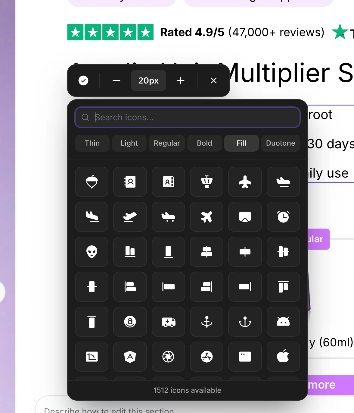
The icon toolbar appears when you click on an icon element within a section. It provides controls for browsing the icon library, adjusting size and weight, changing position, uploading custom SVGs, and deleting icons.
Click on any icon element in the canvas. The toolbar appears above the icon.

The icon toolbar includes the following controls from left to right:
Click the current icon button (first button, showing a preview of the active icon) to open the icon picker panel. This panel has two tabs:
The library tab provides access to a collection of thousands of icons. Features include:
Search bar - Type to filter icons by name (e.g., "arrow", "heart", "check"). The search is instant and filters as you type. Clear the search with the X button.
Weight selector - Six weight options displayed as buttons: Thin, Light, Regular, Bold, Fill, and Duotone. Click any weight to preview all icons in that style.
Icon grid - A scrollable grid showing icons in the selected weight. The currently active icon is highlighted with a ring. Click any icon to apply it immediately.
Icon count - The footer shows how many icons are available (or how many match your search).
The custom SVG tab lets you upload your own icon as an SVG file. This is useful for brand-specific icons or icons not available in the built-in library.
Drag and drop - Drag an SVG file onto the upload area.
Click to browse - Click the upload area to open a file picker.
File requirements - SVG format only, maximum 100KB file size.
Color preservation - Your custom SVG's original colors are preserved (unlike built-in icons which use the current text color).
After uploading, the custom SVG preview appears with a Remove Custom Icon button to switch back to a built-in icon.
For icons inside button elements, Left and Right buttons appear, letting you place the icon on either side of the button text. The currently active position is highlighted.
Three controls adjust the icon size in pixels:
Minus (-) - Decrease size by 2px (minimum: 12px)
Size display - Shows the current size (e.g., "24px") in a highlighted badge
Plus (+) - Increase size by 2px (maximum: 64px)
For icons inside buttons, a trash icon button lets you remove the icon entirely from the button.
The X button closes the toolbar.
Icons support six visual weights, allowing you to match the icon style to your brand:
Weight | Description |
Thin | Delicate, minimal stroke width. Best for elegant, premium brands. |
Light | Slightly heavier than thin. Good for clean, modern designs. |
Regular | Standard weight. The most versatile choice for general use. |
Bold | Heavier strokes for emphasis. Works well at smaller sizes. |
Fill | Solid filled icons. High visual impact, good for CTAs. |
Duotone | Two-tone icons with a primary and secondary fill. Adds depth. |

When uploading custom SVGs, follow these guidelines for best results:
Use viewBox - Ensure your SVG has a viewBox attribute for proper scaling.
Optimize file size - The maximum is 100KB, but smaller files load faster.
Test at target size - Preview your custom icon at the size you plan to use to ensure it looks crisp.