The tag toolbar is a contextual toolbar that appears when you click on a tag element in a section. Tags are small label-style elements used for categories, badges, discount labels, and other short text markers. The toolbar lets you customize the tag's appearance without opening the full config panel.
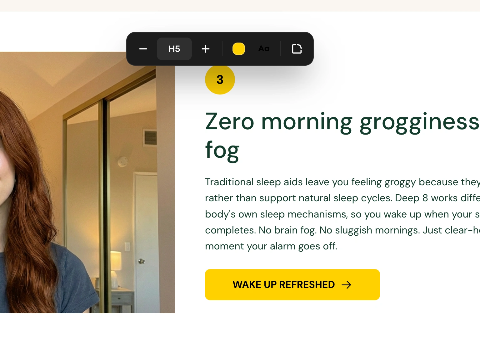
Click on any tag element in the canvas. The toolbar appears above the tag, centered horizontally. It slides in with a smooth animation.

The left side of the toolbar contains text size controls, identical to the heading size system:
Minus (-) - Decrease size one level down
Size dropdown - Shows the current level (H1-H6, P1-P3). Click to see all nine options and select one.
Plus (+) - Increase size one level up
The size levels follow the same hierarchy as all text in the builder:
`` H1 > H2 > H3 > H4 > H5 > H6 > P1 > P2 > P3 ``

Click the colored square button to open the background color picker. This changes the fill color behind the tag text.
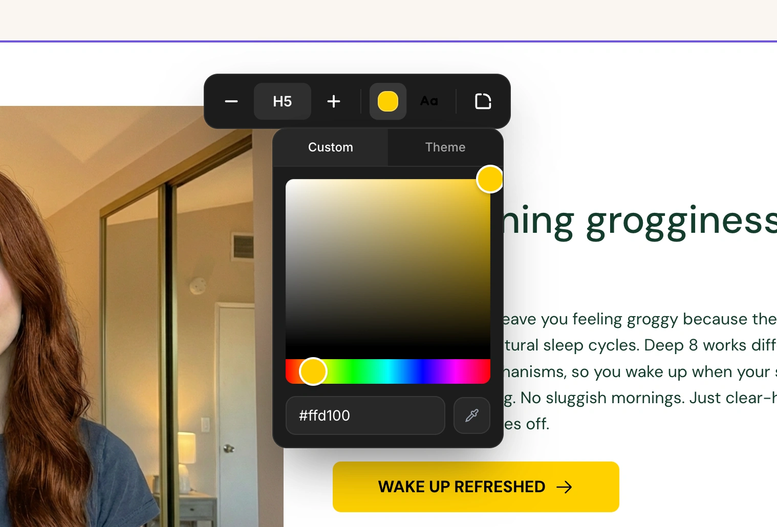
The color picker has two tabs:
Full color picker with saturation/brightness selector and hue slider
Hex color input field for precise color values
Eyedropper tool to pick colors from anywhere on your screen
Quick-access swatches from your brand style:
Brand colors - Primary, secondary, and tertiary
Background colors - Primary and secondary background colors
Click any swatch to apply it instantly.
Click the "A" icon button (showing the current text color) to open the text color picker. This changes the color of the text within the tag.
The text color picker has the same two tabs as the background picker, with swatches organized into:
Brand colors - Primary, secondary, and tertiary
Text colors - Headline and body text colors
Button colors - Button, button hover, and button text colors
Click the rounded corner icon button to open the border radius dropdown. This controls how rounded the tag's corners are:
Option | Result |
None | Sharp square corners |
Small | Slightly rounded corners |
Medium | Moderately rounded corners |
Large | Noticeably rounded corners |
Full | Fully rounded (pill shape) |
Always ensure sufficient contrast between the tag's background and text colors. A dark background with light text (or vice versa) makes tags readable at small sizes.
Switch to the "Theme" tab in the color picker to use your brand style colors. This keeps tags visually consistent with the rest of your page.
If you use tags in multiple sections, use the same color combination for consistency. The hex input field helps you apply exact color values across different tags.