The Colors and Spacing tabs in the Brand Style modal control the visual foundation of your landing pages. Colors set the mood and reinforce your brand identity, while layout and spacing properties ensure your content is properly structured and readable across all devices.
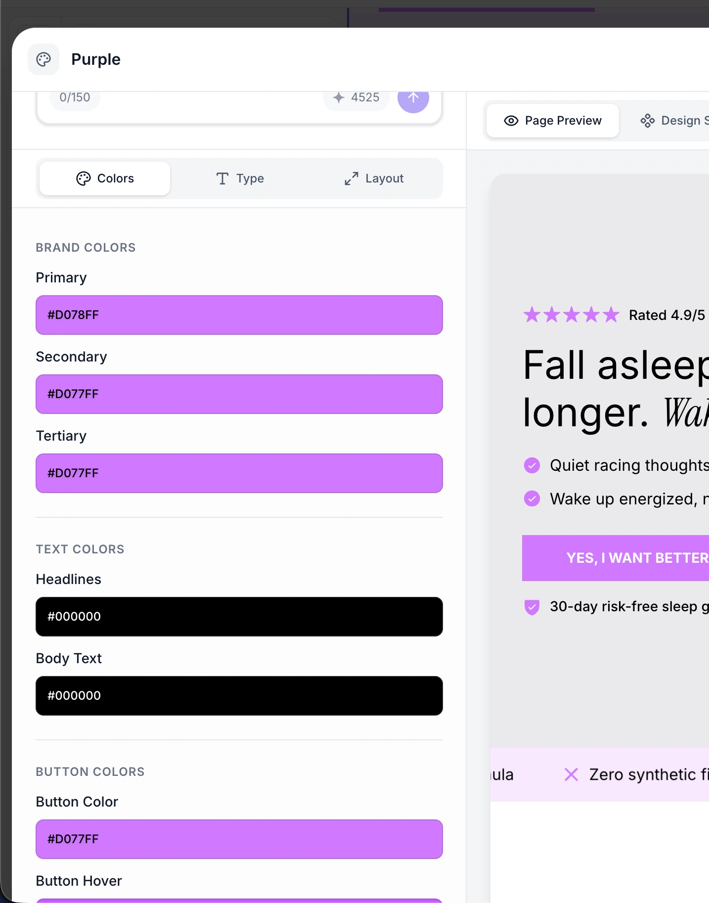
Brand colors are your primary palette - the signature colors that define your brand identity. They are used throughout sections for accents, highlights, borders, and decorative elements.
Property | Description | Example |
Primary | Your main brand color, used for primary accents and emphasis |
|
Secondary | A complementary color for secondary elements and contrasts |
|
Tertiary | A third color for additional variety and accent elements |
|

Background colors define the canvas behind your content. Using two background tiers creates visual depth and helps separate sections.
Property | Description | Example |
Primary background | The main page background color |
|
Elevated background | A slightly different shade used for alternating sections, cards, and elevated elements |
|
The elevated background creates subtle visual separation between sections without harsh dividers. For example, a white primary background with a light gray elevated background makes alternating sections visually distinct.
Property | Description | Example |
Headline color | Color for all headings (H1-H6) |
|
Body text color | Color for paragraphs, labels, and descriptions |
|

#1a1a1a or #2d2926) on white, which is slightly softer than pure black.Property | Description | Example |
Icon color | Color for icons in benefit cards, feature lists, and other icon-based sections |
|
Star icon color | Color specifically for star rating icons in testimonials and reviews |
|
The star icon color is separate from the general icon color because star ratings are a common element that benefits from a distinctive, warm color (typically gold or yellow) regardless of your brand palette.
Button styling is a critical part of your brand style since call-to-action buttons are the primary conversion element on your landing page.
Property | Description | Example |
Button color | Background color of buttons in their default state |
|
Button hover color | Background color when a user hovers over the button |
|
Button text color | Text color of the button label in its default state |
|
Button text hover color | Text color of the button label on hover |
|
Button border color | Color of the button border (when border width is greater than 0) |
|
Button border width | Width of the button border in pixels |
|
Button border examples:
No border (0px): Clean, modern look. Most common style.
Thin border (1-2px): Adds definition, popular with brands like Verb Energy that use light button backgrounds.
Thick border (3px+): Bold, attention-grabbing. Use sparingly.
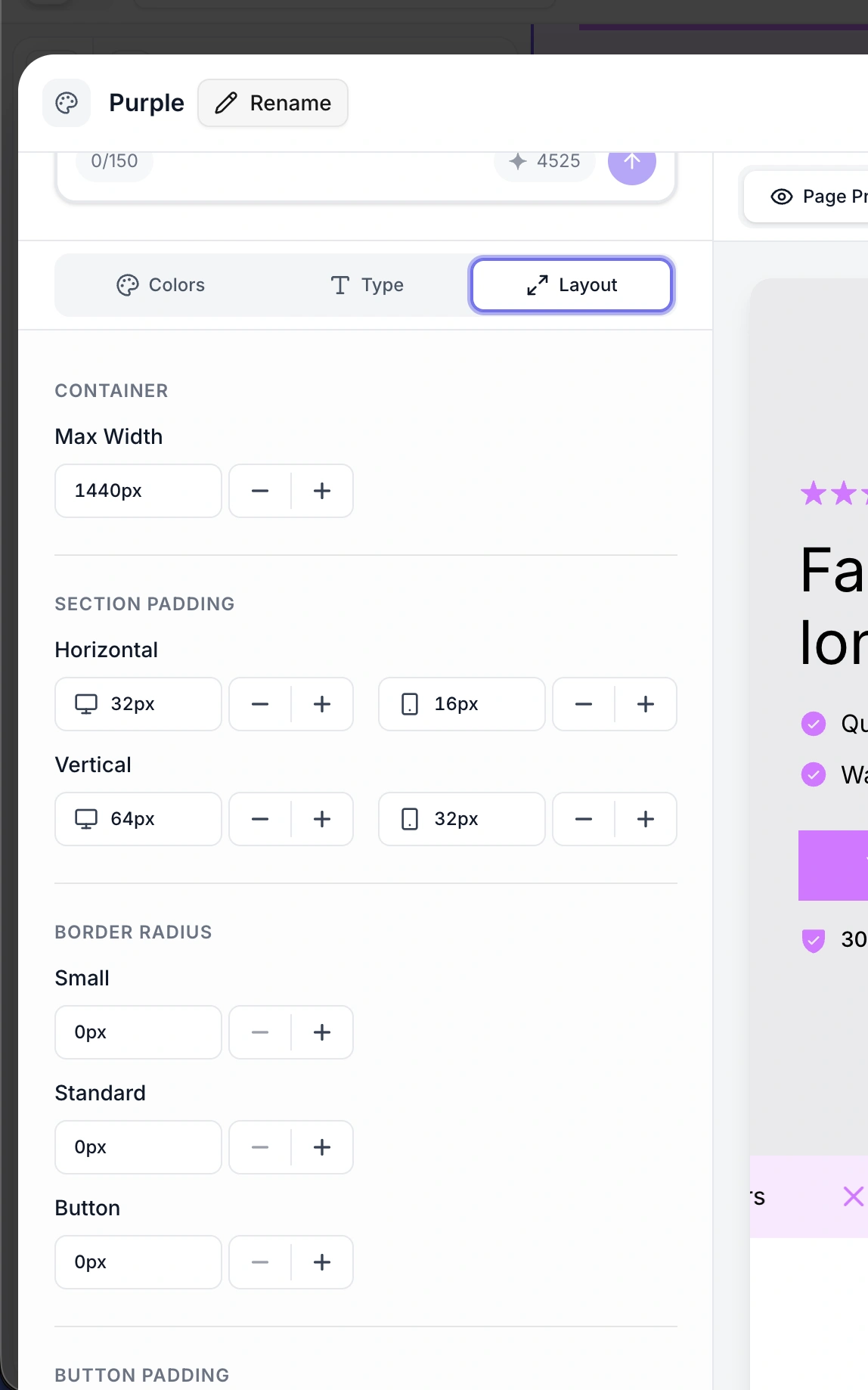
Layout properties control how your page content is structured and spaced.
Property | Description | Example |
Max width (desktop) | Maximum content width on desktop screens |
|
This sets the maximum width of your page content area. Content will never stretch wider than this value, even on large monitors. The content is centered horizontally within the browser window.
1440px - Standard width, works well for most landing pages
1200px - Narrower, more focused reading experience
1600px+ - Very wide, good for image-heavy layouts
Padding controls the space between the edge of the content area and the section content. Desktop and mobile have independent padding values because screens have very different dimensions.
Property | Description | Example |
Desktop horizontal padding | Left/right padding on desktop |
|
Mobile horizontal padding | Left/right padding on mobile |
|
Horizontal padding prevents content from touching the screen edges. On mobile, less padding is needed since screen space is at a premium.
Property | Description | Example |
Desktop vertical padding | Top/bottom padding within each section on desktop |
|
Mobile vertical padding | Top/bottom padding within each section on mobile |
|
Vertical padding controls the breathing room above and below content within each section. Generous vertical padding (64px+) creates an airy, premium feel. Tighter padding (32-40px) creates a more compact, information-dense layout.
Border radius controls how rounded the corners are on various elements.
Property | Description | Example |
Standard radius | Radius for cards, containers, images, and large elements |
|
Small radius | Radius for smaller elements like tags, badges, and chips |
|
Button radius | Radius for buttons specifically |
|
Common radius strategies:
Sharp corners (0px): Bold, editorial look. Used by brands like MUD/WTR and Verb Energy.
Subtle rounding (4-8px): Modern, professional. The most common choice.
Medium rounding (12-16px): Friendly, approachable. Good for wellness and lifestyle brands.
Pill shape (50px): Fully rounded buttons and tags. Popular for health and beauty brands like Ritual and AG1.
50px radius) with moderately rounded cards (16px radius). This makes buttons visually distinct from other elements.Button padding controls the internal spacing of buttons - the distance between the button text and the button edges.
Property | Description | Example |
Button horizontal padding | Left/right padding inside buttons |
|
Button vertical padding | Top/bottom padding inside buttons |
|
Larger padding creates bigger, more prominent buttons. Smaller padding creates compact, inline-style buttons. The defaults (24px horizontal, 12px vertical) produce a well-proportioned button for most designs.
Here is a complete summary of all color and layout properties:
Property | Example | Purpose |
Brand primary |
| Main brand accent color |
Brand secondary |
| Secondary accent color |
Brand tertiary |
| Third accent color |
Primary background |
| Main page background |
Elevated background |
| Alternate section/card background |
Headline text |
| Heading text color |
Body text |
| Paragraph text color |
Icon color |
| Icon color |
Star icon color |
| Star rating icon color |
Button color |
| Button background |
Button hover color |
| Button background on hover |
Button text color |
| Button label color |
Button text hover color |
| Button label color on hover |
Button border color |
| Button border color |
Button border width |
| Button border thickness |
Property | Example | Purpose |
Max width |
| Maximum content width |
Horizontal padding (desktop) |
| Side padding on desktop |
Horizontal padding (mobile) |
| Side padding on mobile |
Vertical padding (desktop) |
| Section padding on desktop |
Vertical padding (mobile) |
| Section padding on mobile |
Standard radius |
| Card/container corner radius |
Small radius |
| Tag/badge corner radius |
Button radius |
| Button corner radius |
Button horizontal padding |
| Internal left/right button space |
Button vertical padding |
| Internal top/bottom button space |