The EcomWize page builder is where you design and edit your landing pages. It is divided into three main areas: the sidebar on the left, the canvas in the center, and the config panel that appears when you select a section.
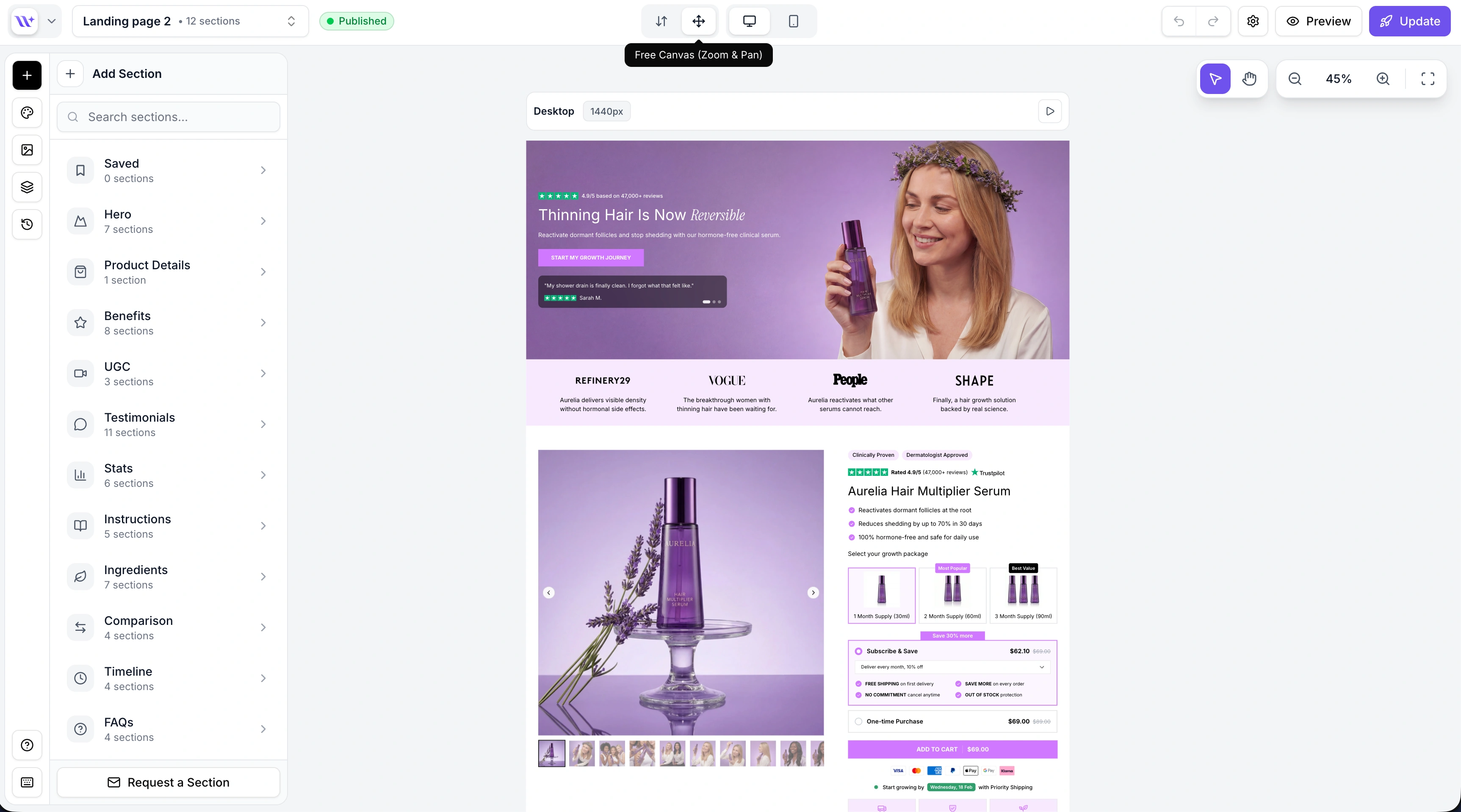
The sidebar on the left edge of the screen gives you access to the main builder tools. It consists of icon buttons that open different panels:
The sections panel is your library of pre-built page components. It opens by default when you enter the builder.
Sections are organized into 15 categories:
Saved - Your saved/bookmarked sections
Hero - Large header sections with headlines and CTAs
Product Details - Product info, variants, pricing, and add-to-cart
Benefits - Feature and benefit highlight sections
UGC - User-generated content and video sections
Testimonials - Customer reviews and social proof
Stats - Statistics and number-based sections
Instructions - How-to and step-by-step sections
Ingredients - Ingredient lists and breakdowns
Comparison - Before/after and versus comparisons
Timeline - Timeline and process flow sections
FAQs - Frequently asked questions accordions
Banners - Announcement bars, ticker banners, and CTAs
Advertorial - Editorial and news-style content sections
Listicles - Numbered list and ranking sections
Hover over a category to see thumbnail previews of each section variant. Click a section to add it to your page.
You can also use the search bar at the top to find sections by name across all categories.
When you click on a section in the canvas, the sidebar automatically switches to the config panel. This is where you edit the selected section's properties - text content, colors, images, layout options, visibility toggles, and more.
Each section type has its own set of configurable properties. The config panel dynamically shows the relevant controls for the selected section.
When no section is selected, the sidebar returns to the sections panel.
The media panel shows your uploaded assets (images and videos). You can upload new files, browse your library, and select media to use in sections.
The media panel opens automatically when you click an image placeholder in a section, making it easy to swap images.
The layers panel shows a vertical list of all sections on your page, in order from top to bottom. You can use it to:
Click a section to select it and scroll to it on the canvas
Drag sections to reorder them
Duplicate or delete sections
Quickly navigate to any section on the page
See Layers Panel for more details.
The history panel lets you manage page versions. You can save a snapshot of your current page, browse previous versions, preview them on the canvas, and restore any version.
See Undo/Redo and History for more details.
Additional sidebar actions include:
Brand Style - Opens the brand style editor where you can change typography, colors, spacing, and other design tokens
Help - Opens the support modal for getting help
The canvas is the large center area where your page is rendered. This is where you see your sections laid out as they will appear when published.
Key canvas features:
Click to select - Click any section to select it and open its configuration
Inline text editing - Click on text elements to edit them directly on the canvas
Drag to reorder - Grab the drag handle on a section to move it up or down
Add section buttons - Between sections, you will see "+" buttons to insert a new section at that position
Section toolbar - When a section is selected, a floating toolbar appears with quick actions (duplicate, delete)
The canvas supports two modes:
Mode | Description |
Normal | Standard scrolling canvas. The page scrolls vertically as you would expect. |
Free canvas | Zoom and pan mode. Useful for getting an overview of long pages. Zoom in and out with scroll, pan by dragging the background. |
See Canvas for a deeper look at canvas features.
The top toolbar runs across the top of the builder and contains essential controls:
Control | Description |
Back button | Return to the dashboard |
Page title / Page switcher | Shows the name of the page you are editing. Click to open a dropdown to switch between your pages without leaving the builder. |
Undo / Redo | Step backward or forward through your edit history ( |
Desktop / Mobile toggle | Switch between desktop and mobile preview to see how your page responds |
Canvas mode toggle | Switch between normal canvas and free canvas mode |
Preview mode | Toggle preview mode to see your page without editing UI (section borders, toolbars, etc.) |
Page settings | Open page settings (title, slug, SEO metadata) |
Publish button | Publish your page to your connected Shopify store |
The AI chatbox is available at the bottom of the canvas. It allows you to rewrite section content using AI.
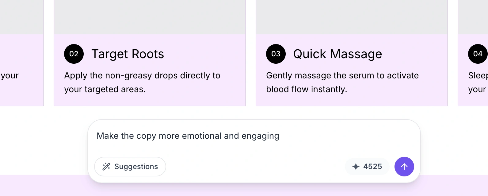
To use it:
Select a section on the canvas
Type a prompt in the chatbox (e.g., "Make it shorter", "More emotional", "Add urgency")
The AI will rewrite the text content of the selected section based on your prompt
Quick suggestion buttons are available for common rewrites. Each AI rewrite uses one AI credit from your account.

The builder supports keyboard shortcuts to speed up your workflow:
Shortcut | Action |
| Undo |
| Redo |
| Copy selected section |
| Paste section |
| Delete selected section |
| Deselect current section |
Canvas deep dive - Learn more about the canvas editing experience.
Keyboard shortcuts - Full list of keyboard shortcuts.